Mamaia Resort Rebrand
As requested by the city’s Destination Management Organization, the resort’s logo needed to be remade. There was a contest to have the logo chosen and mine qualified in the top 10.
I used astrology to create the visual and optimize it according to the needs of the resort that I could spot within its birth chart.
Date of inauguration: 22 august 1906
In Mamaia’s birth chart, we can see a Leo stellium, which means the atmosphere is assertive, it’s visible and it’s fun. Mars sextile Venus shows a well balanced energy between freedom and seriousness. The grand trine points to a need to get out of the comfort zone, so the rebrand should be something that previous designers didn’t approach.
The astrology of the resort shows the need of a “diva” factor, but still welcoming and friendly. It should be remembered by its powerful visual. It needs a spotlight on it.
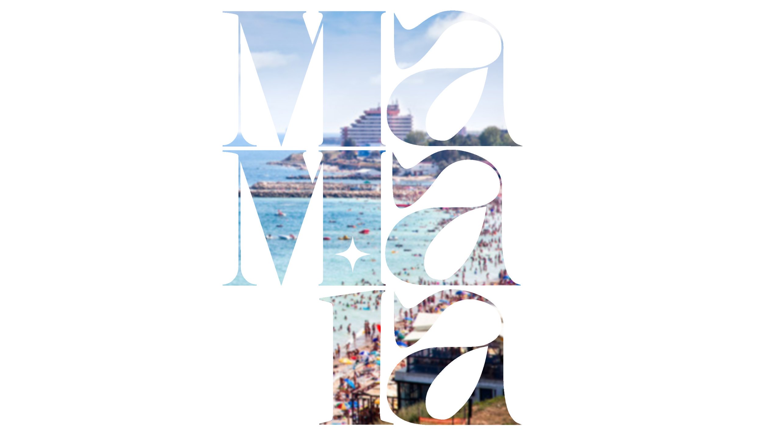
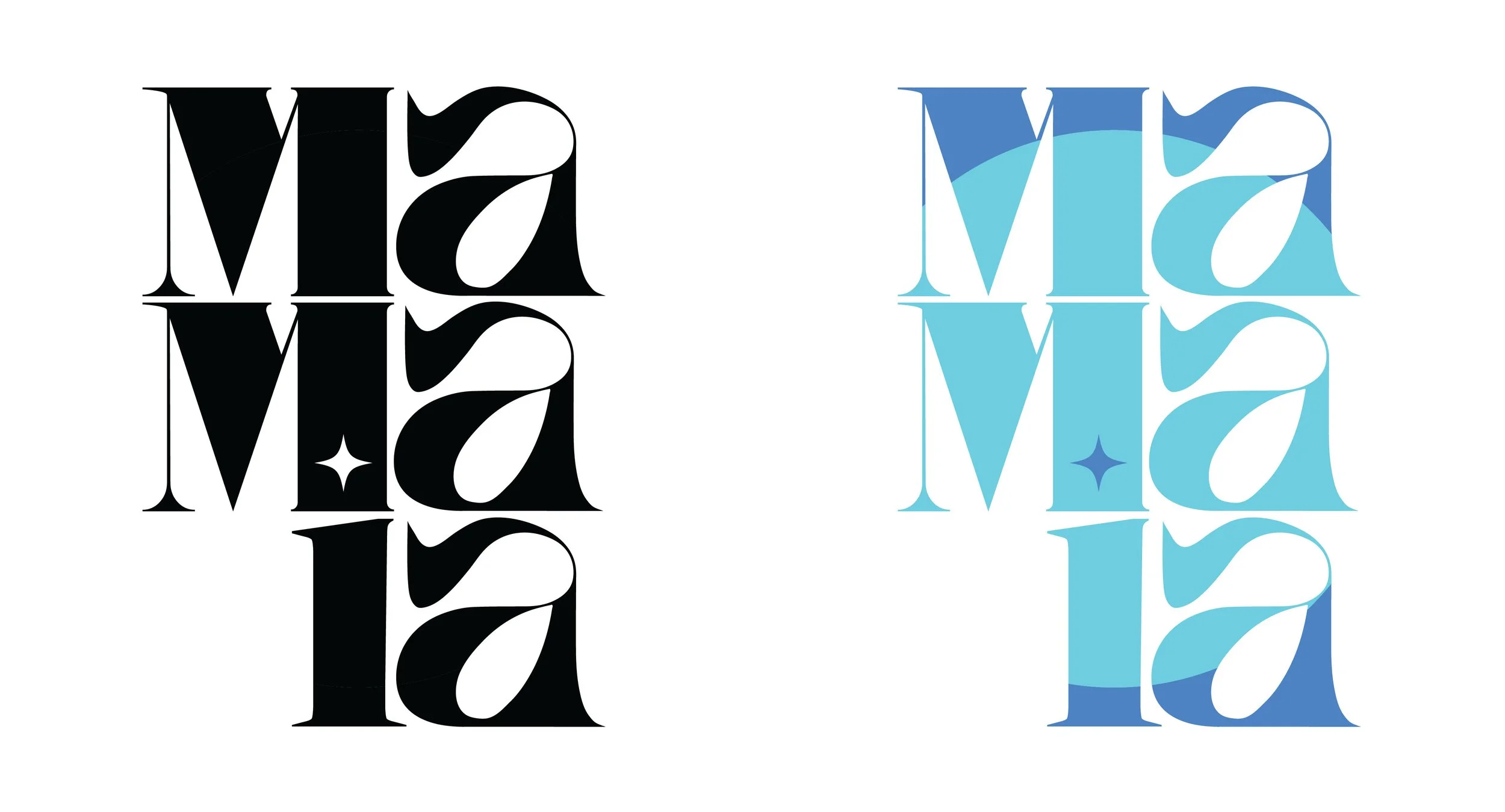
I opted for mainly curves and a few edges, to emphasize the play between friendly and assertive. Leo’s presence led me to using a fuller set of letter. I designed the font for this logo myself.
